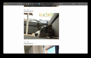
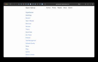
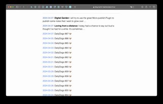
Took the plunge today and changed my theme for the first time since establishing my blog on micro.blog. I'm very apprehensive changing themes and other things that I consider default behavior. Because this either means maintenance for me or maintenance for somebody else. I'm not a very visual person especially when I have to create things. I want to write and I want it to look okay, but I'm not sweating it if the blog looks antiquated or whatever. However, a blog needs some form of a (design) theme and so I have generally opted for whatever the default is. The default is going to be maintained no matter what so it's a pretty safe bet. One thing that irks me a lot about micro.blog's default theme: How invisible the categories are! They are only visible on the archive page, not in the list of posts and not on the single post page either. I find this very impractical, because you can't browse other posts in the same category. Another thing is that the default theme doesn't do proper pagination. The homepage just includes 20 or so posts and that's it. You have to go to the archive page to see more posts, but there they are only visible in a truncated fashion. Long story short: I changed the theme! This one is called Minos and shows the categories above every post and has pagination. For posterity's sake, here are some more or less random screenshots from the blog before changing themes: 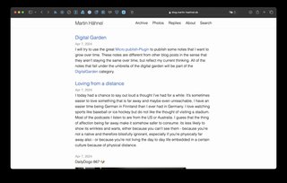
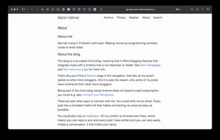
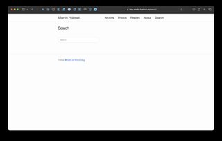
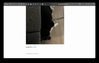
-
← Previous
Digital Garden -
Next →
DailyDogo 868 🐶